• About
  • My Art

Gigi Sperinck

~ "Art is not what you see… but what you make others see" Edgar Degas

Gigi Sperinck

Category Archives: Uncategorized

The Dilkes-Hoffman Pottery and Art Studio & artist, Karin Luciano- A kindred soul I had the privilege to chat to.

05 Tuesday Sep 2017

Posted by gigisperinck in Uncategorized

≈ 1 Comment

During a recent trip to the town of Margaret River in the South-West of Western Australia, I stumbled upon the Dilkes- Hoffman Pottery and Art Gallery, a few kilometres out of town on Caves road.

The functional Pottery belongs to husband and wife team, Tova Hoffman and Rod Dilkes. Tova produces distinctive, contemporary pottery embellished with a ‘Persian’ gold and silver lustre. The concept of Tova’s designs on her pottery, sculptures and moulded ceramics is inspired by aerial views of the landscapes and seascapes of South-Western Australia. Her designs are a tribute to the beauty of the forests and to the unblemished beaches of the South West. Tova’s ceramics are stunning and very hard to resist, but I have a passion for colour and what drew my attention was the paintings on the gallery walls.

The gallery showcases the paintings of the well-known Margaret River artist  Karin Luciano. One could call her the ‘Artist in residence’, as she has the use of a painting studio in the gallery and does gallery duty once a week on a Sunday. Karin is also represented by the Jahroc Gallery in Margaret River. I was lucky enough to have a chat with her. On learning that I am a Trainee Gallery Guide at AGWA, Karin graciously welcomed me into her gallery-studio and happily answered my questions about her artistic background and her creating processes.

Continue reading →

PURPLE REIGN  

23 Wednesday Nov 2016

Posted by gigisperinck in Uncategorized

≈ Leave a comment

Purple Rain 032

A Passion for Purple

Purple; a deep rich shade between Crimson and Violet is a Femme Fatale.

Purple is feminine; a Lady in Lavender, a Maiden in Mauve, a Madam attired in gorgeous Plum, a Vixen in Violet, and sometimes a ‘Shrinking’ Violet. If Purple were a person, she would be female and not always a lady. The beautiful, but murderous orchid ( ‘orchid’ also a term for pale purple) has beautiful flowers, but is a parasite and eventually kills her host

Purple symbolises royalty and conjures images of pomp and ceremony. For centuries, coronation robes have traditionally been purple; soft lilac and sometimes a rich, dark hue of Aubergine. In contradiction, the colour Purple does not like to show off and prefers the back to the foreground. Purple is mysterious, sometimes shy and at times shocking. A thick pile, purple, shaggy carpet I encountered recently unsettled me somewhat.

Whether you like, love or hate this girl, avoid her you can’t. She lurks in everyday shadows, shimmers at the edges of clouds and hides in distant mountain tops.

Purple Paint

On my artist’s palette, I create the deepest dark tones for my shadows by mixing Cadmium red and Pthalo blue, deep purple, the colour of midnight.A palette for portraiture requires a range of purples; blood runs red in blue veins underneath the human skin’s surface.I combine cool and warm reds and blues and add white to mix tints of true purple.

Magic

Impossible to mix on my palette and best used straight from the tube is luminous, shocking pink Magenta. Magenta leans toward purple and is halfway between red and violet; it is the complimentary of green as it absorbs all the green light in the spectrum of light.Combinations of purple and pink evoke a seductive or romantic mood especially if accompanied by carbon black. Magenta is feminine and sexy, a provocative lady of the night.Named in 1912 ’Electric Purple’, halfway between Violet and Magenta is said to be the purest and brightest purple.

A Gentle and Graceful Lady in the Garden

Spring is in full swing, and Jacarandas are in full bloom around Perth; their lilac flowers are announcing the approach of another hot summer.

I am feeling ambivalent about their tiny flowers; they carpet my patio in a gorgeous shade of lavender but require hours to sweep.

Bougainvillaeas are ‘dressed to the nines’ in their bright pink, mauve and amaranthine splendour; it will be a month or two before fragrant lilac trusses adorn the Wisteria. Let’s not forget a favourite of Vincent Van Gogh’s, the delicately perfumed Iris. The blue–ish purple petals of the Saffron flower is shown off to perfection by their complimenting sunny yellow centre.

Miss Marple

Perhaps we associate mauve with the elderly because the word lavender stirs up images of mature ladies with mauve/blue rinses.? Soft shades of purple are soothing and calming and bring life’s stresses into a peaceful perspective, like an older Lady, perhaps a mother would be inclined to do.Lilac is a classic colour choice for the walls of hospices. Serene Lavender hues create a tranquil mood and have been the symbolic colour of piety, mourning and penitence.

Purple Pigments

For centuries blackberries, mulberries, sea snails and sea urchins usually in combination with ammonia (urine) were used to extract the sought after purple pigment. Synthetic, organic pigments, such as mauveine (named after the mallow flower) and fuchsine later became available.Quinacridone came onto the market in the 1950’s and is still widely used today.

A Passion for Purple

Who doesn’t connect the colour purple with ‘melt in the mouth’ creamy chocolate?

A lengthy legal battle has been fought between chocolate manufacturers, Nestle and Cadbury over the right of ownership of the distinctive purple colour. To date, neither has won the sole right to register the colour under their brand name, as a trademark Pantone colour. ‘True Purple’ or ‘Patriarch Purple.’ was named in 1925 because its hue is halfway between red and blue and its value exactly halfway between black and white.

In the Sixties, blue pigments were added to Fluorescent Magenta to make ‘Fluorescent Purple’ or ‘Psychedelic Purple’ and was favourited by the Hippies.

The colour of the grapes from which my favourite drink is distilled from, except perhaps for ‘Fluoro’, I will leave that one to the Hippies, Purple remains pertinent on my palette.

Cheers! To Purple

“I don’t paint pictures in hopes that people will understand them. They …” — Art of Quotation

26 Tuesday Jul 2016

Posted by gigisperinck in Uncategorized

≈ Leave a comment

Amazing Fine Art

“I don’t paint pictures in hopes that people will understand them. They understand them, or not, according to their own capacity.” —Pablo Picasso, Spanish, painter

via “I don’t paint pictures in hopes that people will understand them. They …” — Art of Quotation

View original post

‘This Softly Blooms’ by Debi Riley Relating to art nothing is permanent, nothing is perfect and nothing is finished.

25 Monday Jan 2016

Posted by gigisperinck in Uncategorized

≈ Leave a comment

Source: This Softly Blooms

Photography Quote of the Day

24 Tuesday Nov 2015

Posted by gigisperinck in Uncategorized

≈ Leave a comment

Photography Quote of the Day

25 Sunday Oct 2015

Posted by gigisperinck in Uncategorized

≈ Leave a comment

We see things not as they are, but as we are. – H.M. Tomlinson If you would like to download any of our previous Quotes of the Day please visit: PI Photography and Fine Art

Source: Photography Quote of the Day

A ZEST FOR LIFE

04 Sunday Oct 2015

Posted by gigisperinck in Uncategorized

≈ 1 Comment

Tags

orange paint, painting

Oranges

Flamboyant Orange is not Shy, and it likes to Show off.

The colour orange has been named after a fruit, and the colour is as sweet on the palette as the fruit is on the palate. Cadmium Orange, Tangerine and Vermillion remind me of sweet orange cordial, summer and childhood. My mother planted nasturtium flowers en masse in her garden. Nasturtiums are such complicated little flowers to paint!


still life new still life Gigi Sperinck

Orange is not my all-time favourite colour, but I appreciate its value and it has a space reserved on my palette. A secondary colour, orange is easy to mix, using red and yellow; but for a dazzling, bright and lasting orange pigment, the colour is at its best freshly squeezed (like the fruit) straight from the tube.

Continue reading →

How Do You Learn to Be an Artist?

21 Friday Aug 2015

Posted by gigisperinck in Uncategorized

≈ Leave a comment

Art Matters

Positive thoughts on the subject of art education by an artist who had a passion for art – Mercedes Matter

Painting OWU

Mercedes Matter was an important figure in 20th century American art, both as a painter and one deeply involved in the education of artists. As founder of the New York Studio School, where she taught and served as dean, Matter helped shape generations of artists as well as the critical discourse about art, its meaning, its practice, and its role in society. This article first appeared in the New York Times, September 2, 1973. Almost 40 years later, her insights seem to have only gained in relevance.

How Do You Learn to Be an Artist?
By Mercedes Matter

Since, in a world greatly transformed, the visual arts have presumably moved far from the premises of art in the past, is there any use for a young artist, in 1973, to study the traditional disciplines?

I say decidedly yes – were this only a matter of becoming visually literate. How arrogant…

View original post 1,475 more words

INTO THE BLUE

04 Thursday Jun 2015

Posted by gigisperinck in Uncategorized

≈ 5 Comments

Tags

aquamarine blue, colour, ocean colour, painting, sky colour

The Colour of Infinity
IMG_0954

I am feeling a little Blue  

I have recently returned from a cruise to the Pacific Islands and haven’t lost my sea-legs yet. The taste the Mojitos and Pina Coladas still lingers on my lips. It was while I was sipping one of those delicious cocktails and enjoying the spectacular ocean view from my deck chair that my daughter suddenly asked”Mum, Why is the sky blue? ”

Out at sea, on a warm sunny day, all around as far as the eye can see the ocean stretches out in the most beautiful colour of French Ultramarine Blue. Exactly the same colour as the pigment in my artist quality paint tubes.

Continue reading →

SEE, HEAR AND DO NO EVIL?

16 Monday Feb 2015

Posted by gigisperinck in Uncategorized

≈ 1 Comment

Tags

Art, artists, communication

Capture speak no evil

“Do you know that it is very, very necessary for honest people to remain in art? Hardly anyone knows that the secret of beautiful work lies to a great extent in truth and heartfelt sentiment”  Vincent Van Gogh in a letter to his brother Theo.

Reaching Out through Art

The artist does have a purpose with his art, but his focus is not always the achievement of an aesthetically pleasing image.

Sometimes creating art is the best, if not the only way an artist can communicate his message; it is his chosen language.

We are social creatures, and I don’t know any artists who keep their art hidden away from the eyes of others. Except perhaps the proverbial, slightly mad and reclusive artist who lives on the fringes of society. Art has to be seen to be appreciated; I am not referring to the piles of unfinished canvases that some of us might have stashed away, meaning to complete in the fullness of time.Their day in the spotlight is yet to come.

Making connections

A baby’s piercing cry is intended to cause distress; it is impossible to ignore, and it usually prompts swift action. That is how we make our first connection with others.By adulthood, most of us have perfected a way of communication that satisfies our individual needs.

Talking, Singing, Dancing and Writing

There are The Speakers among us who eloquently communicate. These articulate masters can express their every opinion and emotion with ease. Some fuel wars with propaganda spread by the spoken word. Speakers, often the leaders in our society, can hold audiences captive and spellbound with their voices alone.The spoken word is powerful Sometimes though silence is golden.

Performing Artists such as actors and singers make connections in this way too. Musicians reach others with their instruments and music. Music crosses the language barrier.

Writers capture our attention, the written word – black on white, is hard to ignore.Historians connect generations past, present and future with the written word.Empty is the world of the illiterate.

Writers of fiction have the ability to introduce us to new worlds, even new dimensions.In the absence of illustration, the reader is left with a mind imprint that lingers because he has been forced to use his imagination.A Writer can give his creations whatever characteristics he chooses, even immortality. He can give them wings and let them fly if he wants to. Writers understand the enormous power of the imagination

The Language of Art

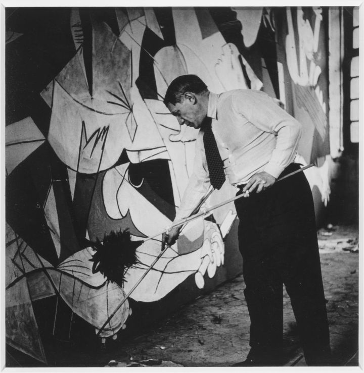
A Painter speaks through his art with his paint and brushes.Every time you look at a painting you should ask yourself what the underlying message is.

There always is one.

Capture bright flowers
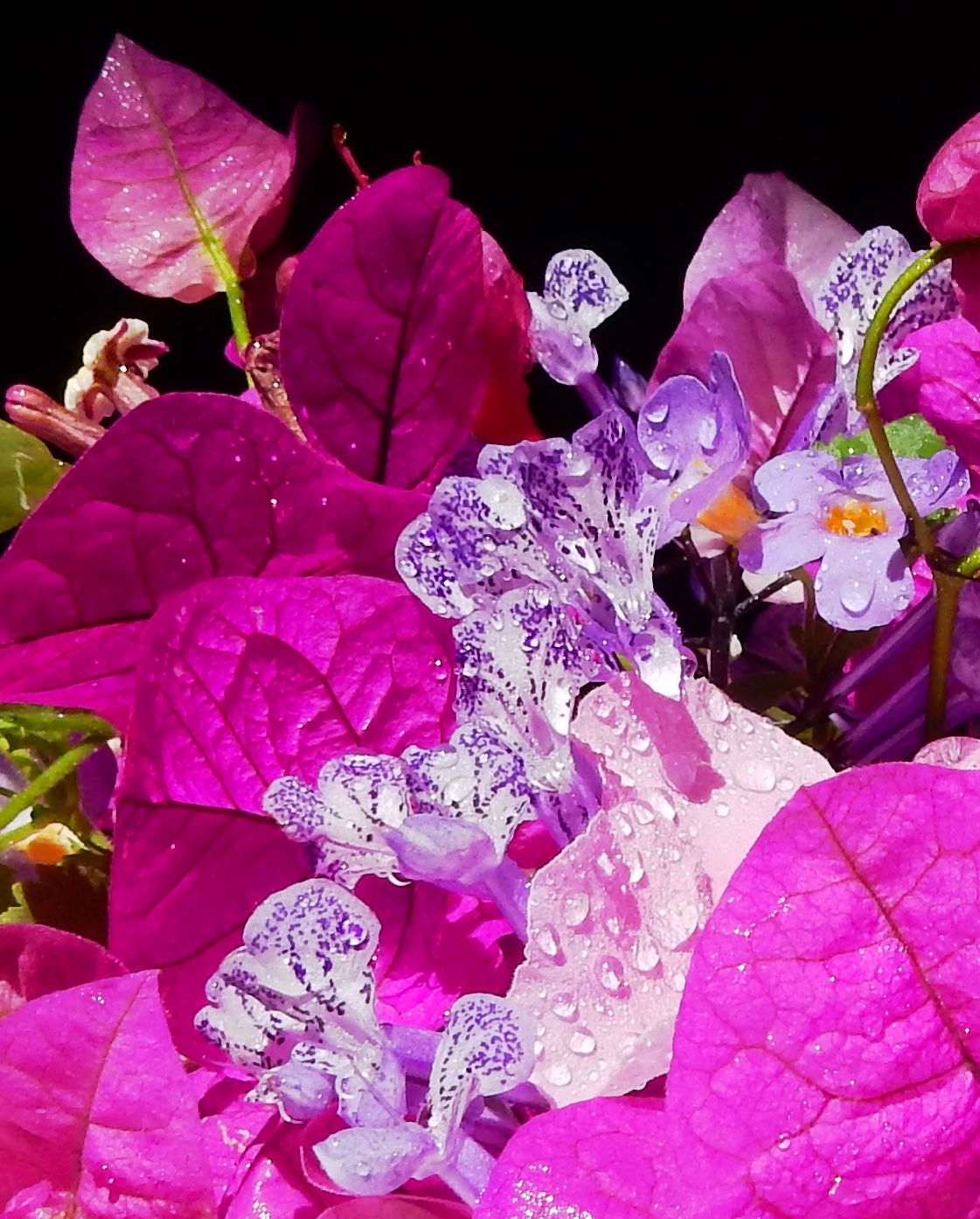
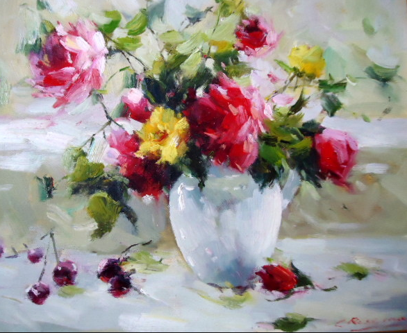
The message can be quite subtle. With this painting of sunlight reflected on a vase of colourful flowers, the artist is perhaps encouraging a smile and urging you to enjoy and appreciate the simple beauty of the ordinary. Light and colour lift a somber mood. 

As a painter, I understand that it is sometimes difficult for an artist to get across the right message.

Individuals interpret images differently.I experience subdued almost melancholic feelings of peace and serenity when I look at a painting of a beautiful sunset; you might have an entirely different experience.

The painter’s intention might be to shock the viewer with images or symbols of violence and war. Perhaps there is a warning or a  plea for peace in his work.Capture painting of war

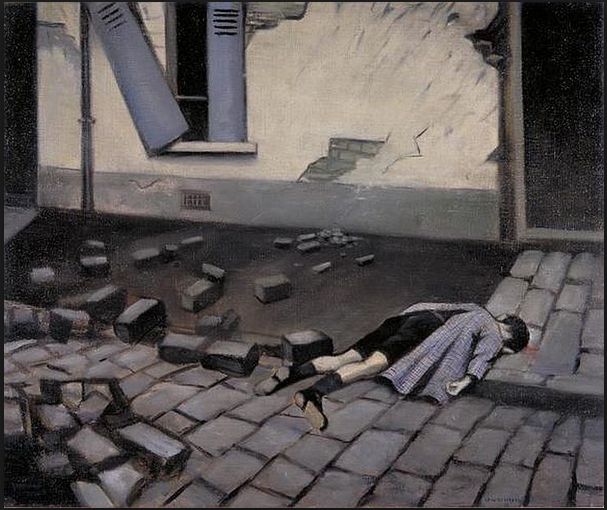
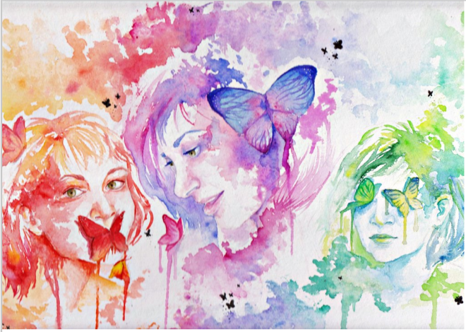
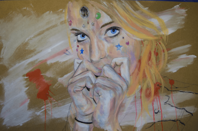
Fear of the future and teenage angst in art is easy to interpret.Young artists have fewer inhibitions and are usually quite expert at getting their message across.

Capture teen angst

The old saying  ‘Seeing is believing’ rings true from a painter’s perspective. To ‘see for oneself’ is an enriching experience. A blank canvas gives the artist permission to paint on it whatever he wishes to. He can reach deep into his imagination and make the impossible possible. Magic.

A painter can paint can copy nature realistically or warp reality, and he can twist the truth when the truth stripped bare is too confronting.

Why?

 I accept that art does not always have to be traditional, but the trend seems to be that the more shocking a painting is, the better it is.

Some artists will do anything to have their minute of fame. I question the validity of art that emphasises the vulgar, the grotesque and the shocking. Perhaps there is the necessity to juxtapose good and bad to gain a full understanding of their meaning.Also, if you’ve come face to face with the monster or painted him (it), looked him in the eye and walked away, you have conquered.

Each to his own I guess.

I believe that there are things about humankind that are better left unsaid.Our world could be a much better place if we all strove to build on the positive rather than on the negative.

That is my message.

  • gigisperinck
    • The Dilkes-Hoffman Pottery and Art Studio & artist, Karin Luciano- A kindred soul I had the privilege to chat to.
    • PURPLE REIGN  
    • “I don’t paint pictures in hopes that people will understand them. They …” — Art of Quotation
    • ‘This Softly Blooms’ by Debi Riley Relating to art nothing is permanent, nothing is perfect and nothing is finished.
    • PRINT OR PAINTING? WHICH WILL YOU CHOOSE?
    • Photography Quote of the Day
    • PURPLE REIGN  
    • Photography Quote of the Day
    • A ZEST FOR LIFE
    • THE INGENIOUS ARTIST IS CREATIVE , CLEVER AND SOMETIMES HAS A TOUCH OF MADNESS

Blog at WordPress.com.

Privacy & Cookies: This site uses cookies. By continuing to use this website, you agree to their use.
To find out more, including how to control cookies, see here: Cookie Policy
  • Follow Following
    • Gigi Sperinck
    • Already have a WordPress.com account? Log in now.
    • Gigi Sperinck
    • Customize
    • Follow Following
    • Sign up
    • Log in
    • Report this content
    • View site in Reader
    • Manage subscriptions
    • Collapse this bar
 

Loading Comments...