
Tags
Flamboyant Orange is not Shy, and it likes to Show off.
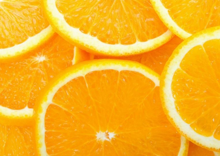
The colour orange has been named after a fruit, and the colour is as sweet on the palette as the fruit is on the palate. Cadmium Orange, Tangerine and Vermillion remind me of sweet orange cordial, summer and childhood. My mother planted nasturtium flowers en masse in her garden. Nasturtiums are such complicated little flowers to paint!
 Gigi Sperinck
Orange is not my all-time favourite colour, but I appreciate its value and it has a space reserved on my palette. A secondary colour, orange is easy to mix, using red and yellow; but for a dazzling, bright and lasting orange pigment, the colour is at its best freshly squeezed (like the fruit) straight from the tube.
A Touch of Orange Brings Art to Life
It shouts, “Look at me!” If blue tones in a painting become too dominant, a wash or a glaze of orange will make it recede. Using orange, magenta, red and yellow next to each other creates a joyous harmony of warmth and beauty.
They Go Together
The complementary colour of orange is azure, a colour halfway between blue and green reminiscent of the sea. Place the two side by side and voila! Magic. Orange and blue, the colours of the sun and the sea are the colours of care-free summer days.
“There is no orange without blue” Vincent Van Gogh said in a letter to his brother Theo. For Vincent, orange/yellow was the colour of sunlight.
The colour Orange has an enthusiasm for life, but it sparks more controversy than any other colour. Orange is polarising, you either love it or hate it.
Often associated with amusement and entertainment, orange gets people talking; it is impossible to ignore the invigorating vibrancy of orange. Frank Sinatra said, “Orange is the happiest colour” Orange symbolises energy and has an uplifting effect.
Tarnished Orange,
On the downside, orange can be abrasive and crass and can suggest bad taste and even a lack of intellectual values. It also has a reputation for encouraging risk-taking. Using too much orange in a painting will be a gamble for sure.
Enticing!
The colour of autumn leaves and the harvest, orange is associated with flavour and aroma. It stimulates the appetite, think – paprika, turmeric, saffron and comforting sweet pumpkin pie.
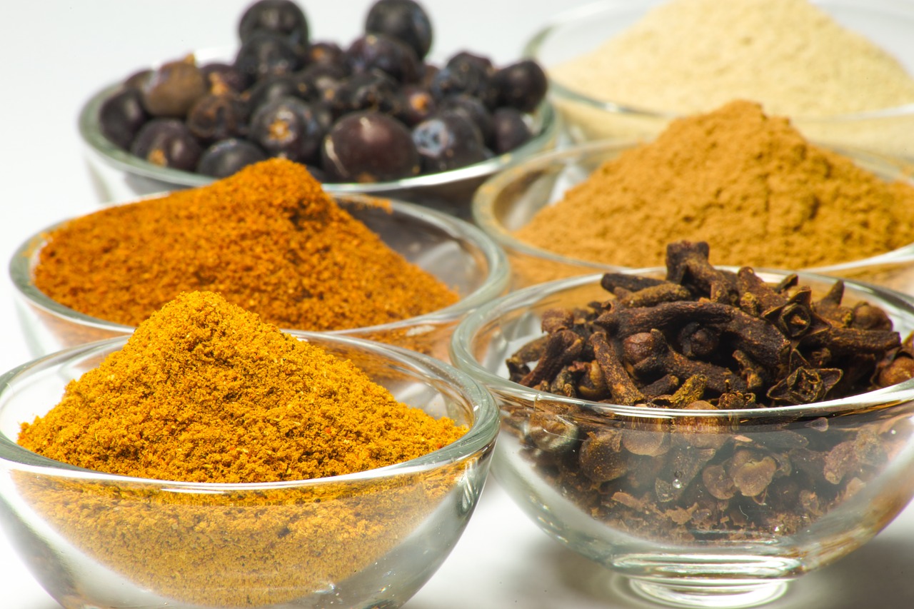
Restaurateurs know that orange encourages social communication and customers to linger for longer. Warm Terracotta(orange) tiled floors and earthen russet coloured pizza ovens or colourful curries oozing with flavour!
Not quite so appetising, orange dyes are sometimes added to chicken feed to make the egg yolks more orange and also to cheese and other foods to enhance the orange colour. The controversial synthetic dye tartrazine has been commonly used in children’s medication, to make it appear more palatable. Orange implies good health, flavour and sunshine, an orange is sweet, round and delicious.
A Scorcher!
Orange is hot, the colour of fire and searing heat; it is impossible to feel cold in the presence of orange. Orange is dominant and next to red it is the most popular colour with extroverts, it is less dominating and aggressive than red, but it has more pizzazz than yellow and shouts louder.
Buoyant ..
Of all the colours, orange is the easiest one to see in dim light; this is the reason lifebuoys are a bright orange colour. In nature, the colour orange is sometimes a warning; like the red-orange spot on the deadly Australian Redback spider.
So Glorious and Divine:
Closely linked to spirituality, orange seems to have a mystical quality. The bright orange robes of Buddhist monks signify a commitment to the order. For Christians, orange represents gluttony but its close neighbour, Amber relates to sanctity and purification. Perhaps because of its tendency to dominate over other colours, Fashion has been indecisive about orange. Considered ‘groovy’ in the 1970’s, Orange lost its allure until recently when it has again been seen strutting down the catwalks.
“Orange is red brought nearer to humanity by yellow” Vasily Kandinsky.
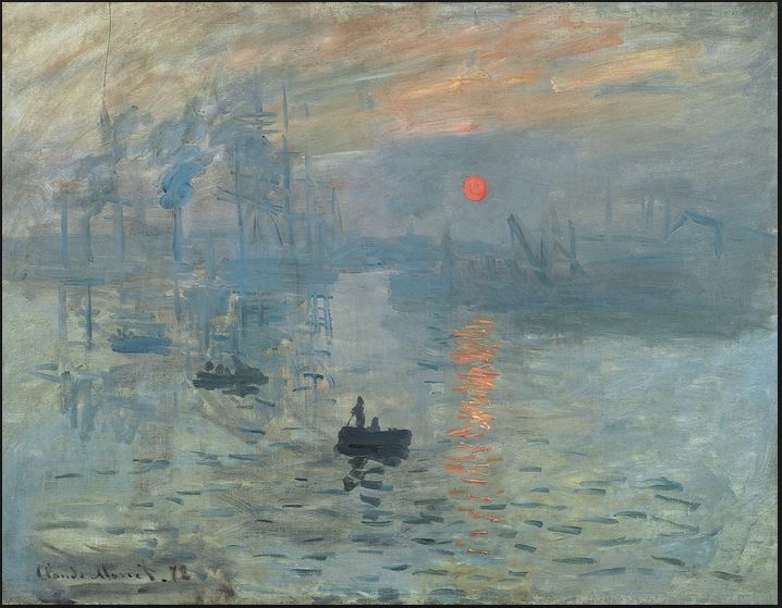 Orange is a glowing sunrise in a painting, a distant orange dot of the sun seen through a haze. In 1872, Claude Monet painted ‘Impression Sunrise’.
The orange of the tiny sun is a perfect compliment to the blue-green of the hazy sky and the water. This painting gave its name to the Impressionist art movement. The Impressionists loved experimenting with complementary colours.
Happiness is –
Orange enhanced the sense of fun and frivolity in the paintings of Toulouse-Lautrec, he used it next to his favourite colour black.
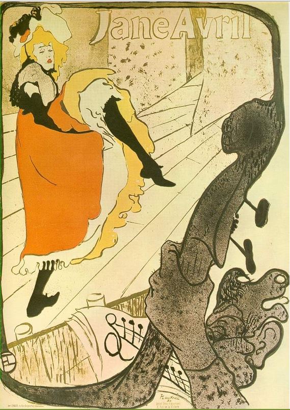 “ Jane Aril” 1893-1896.
The Post-Impressionist Henri Matisse favoured bright oranges, red and yellow hues.
Henri Matisse “Joy of Life.”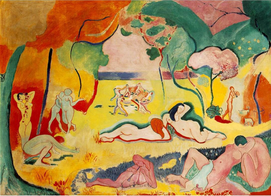
Sour Orange can be Bitter
Intense orange added exoticism to Paul Gauguin’s work. He used bright colours to the extreme; his intention was perhaps to shock or at least evoke an unsettling or disturbing mood. He said, “Pure colour! Everything must be sacrificed to it” Gauguin believed that colour could express feelings, rather than just describe a scene. His themes were often mortality and procreation and were rather morbid. Although they are loud, his oranges, yellows and reds do not create a sense of joy and happiness. He favoured Vermillion, an almost red-orange, used here in his
“Yellow Christ” 1889.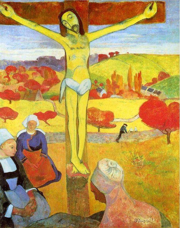 He used brilliant oranges and reds and juxtaposed them against black lines; his black was diluted Prussian blue. The flat perspective and darkly outlined shapes of Gauguin’s style of painting,’ cloisinism’ reminds me of stained glass. A group of artists who called themselves ‘The Fauvists’ (The wild beasts) whose intent was undeniable to shock the senses, were inspired by Gauguin’s use of bright undiluted colour.
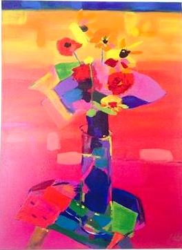
Orange demands attention. It adds zest to art and evokes a range of moods and emotions. Between red and yellow there are many shades of orange; russet, tangerine, mango, salmon, melon, peach and countless more. And every orange has a blue to complement it to create the perfect marriage.
A drop of orange is sweet in your glass and a squeeze of cadmium orange on your palette, a feast for the eye.

An interesting post on orange. I like a little of it in a painting. Too much will make me anxious. And I agree orange and blue is a perfect combination.
LikeLiked by 1 person